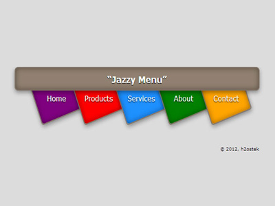
Finished Product
Definitions
- CSS3 Transitions
- A transition is the simplest form of CSS3 animation; it defines an effect which is triggered between two states; a start and a stop. With CSS3, and the
transitionproperty we can add an effect when changing from one style to another, without using Flash animations or JavaScript. - CSS3 Transform
- The
transformproperty applies a 2D or 3D transformation to an element. This property allows you to rotate, scale, move, skew, etc., elements.
Browser Support

The transition property is supported in Internet Explorer 10, Firefox, Opera, and Chrome.
Safari supports an alternative, the -webkit-transition property.
Note: The transition property is not supported in Internet Explorer 9 and earlier versions.
How It's Done
HTML
<nav class="menu">
   <ul>
      <li class="purple"><a href="#">Home</a></li>
      <li class="red"><a href="#">Products</a></li>
      <li class="blue"><a href="#">Services</a></li>
      <li class="green"><a href="#">About</a></li>
      <li class="orange"><a href="#">Contact</a></li>
   </ul>
</nav>
CSS
.menu {
   width: 900px;
   height: 60px;
   background-color: #908070;
   border-radius: 10px;
   box-shadow: -2px -1px 20px #444 inset;
   position: absolute;
   top: 80px;
   left: 30px;
   text-align: center;
}
Styling the <H3> tag to place in middle of menu bar and give it some shadow effects.
   .menu h3 {
      text-shadow: 0px -1px 0px #004;
      text-align: center;
      line-height: 10px;
   }
We now need to style the list tags: <li>. Don’t forget to add the z-index: 1; otherwise the <li> tags won’t tuck under the menu bar!
.menu li {
   float: left;
   width: 148px;
   height: 205px;
   position: relative;
   top: -16px;
   left: 55px;
   z-index: -1; /* hides li under menu bar */
   display: block;
   list-style-type: none;
   line-height: 60px;
   border-radius: 5px;
   border: 1px solid #908070;
   box-shadow: 2px 1px 8px rgba(255,255,255,0.6), -1px -1px 15px rgba(0,0,0,0.6) inset;
   /* spin li tags to create angled menu options */
   /* needed for Chrome browser
   -webkit-transform: rotate(-20deg);
/* rotates the <li> tags to give us the angle needed */
   transform: rotate(-20deg);
}
The <a> tags need styling too. We use the transform property to spin the Labels.
.menu li a {
   position: relative;
   top: 90px;
   left: 5px
   height: 100%;
   width: 100%;
   color: white;
   font-size: 28px;
   display: block;
   text-decoration: none;
   width: 75px;
   padding: 0px 0px;
   text-shadow: 0px -1px 0px rgba(2,2,0,0.6);
   /* spin label names to flow with li tags */
   /* needed for Chrome browser */
   -webkit-transform: rotate(90deg);
   transform: rotate(90deg);
}
When we hover over the <li> tags, the padding will be stretched from 0-40px
.menu li:hover {
   transition: padding linear transform 5s;
   padding-bottom: 40px;
}
Giving each menu label or <li> tag a different background color.
.purple {
   background-color: #800080;
}
.red {
   background-color: #ff0000;
}
.blue {
   background-color: #1e90ff;
}
.green {
   background-color: #008000;
}
.orange {
   background-color: #ffa500;
}