PS - FROSTED TEXT EFFECT
settings used to get the desired effect of frosted text using Adobe Photoshop.
PhotoShop Text Layering Effects
With PhotoShop, you can do some amazing things with text effects. It's not the easiest, at least for me, to grasp. But, with some patience and plenty of trial and error you can achieve some pretty cool stuff. Take for instance the text effects applied to achieve a 'frosted' type.
Before you get started, a key component to make these effects come together is a good background. I have provided the background I used for you below.
The "Finished Product" is our goal. I have put together screen shots to show how I was able to achieve the desired effect. At any time if you have trouble seeing the images clearly, simply click on them. They will be viewed at maximum size.
Finished Product


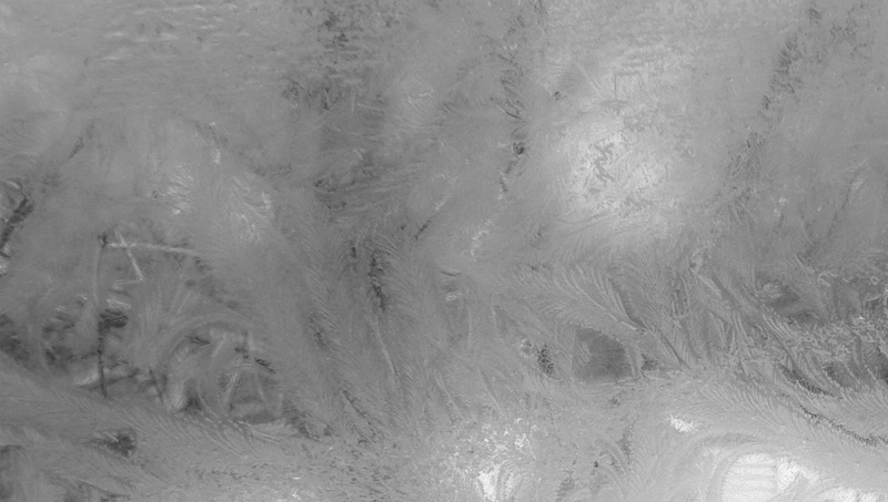
The first thing you need is the background. I found this background on the Internet somewhere. I believe I googled rain images. I wanted a background that was a bit dark and looked as though it was cold outside. This one seemed to work for me.
Background Image
How It's Done
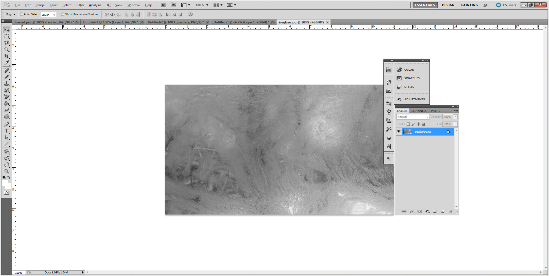
First, open up Photoshop and drag and drop the background onto the empty workspace to create a new file.
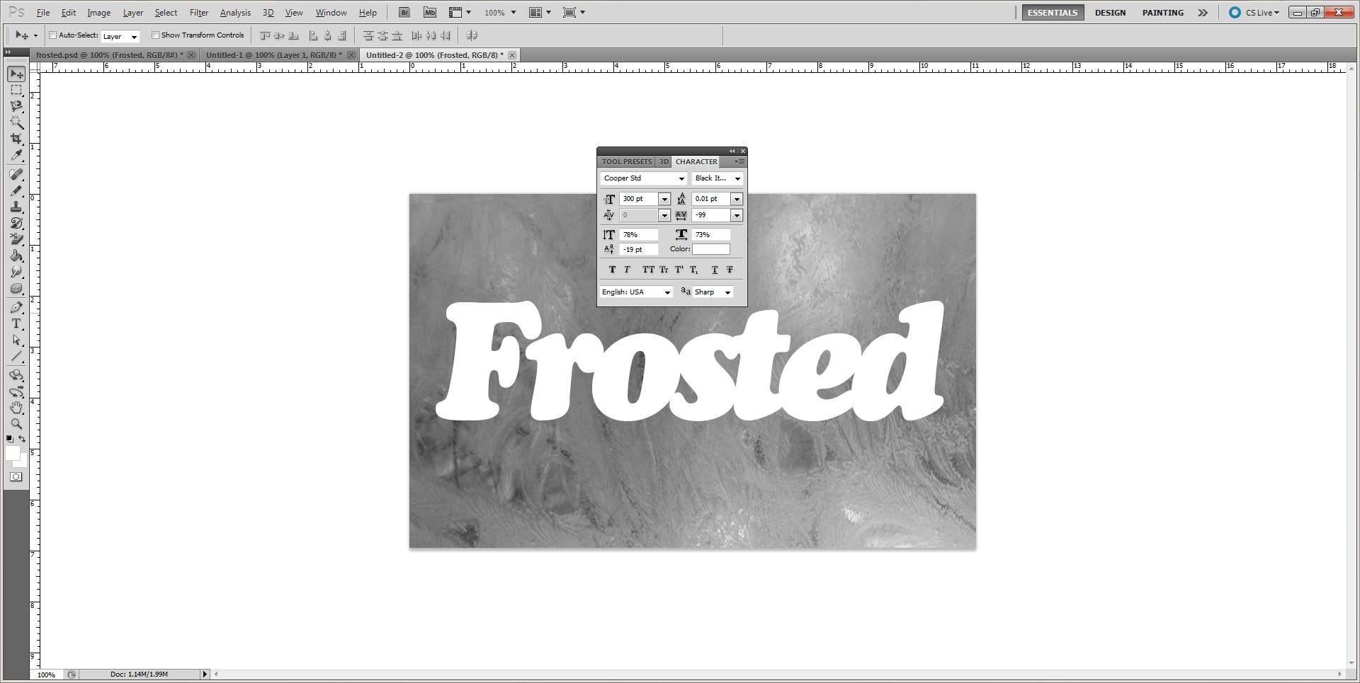
Once the background has been set, Select your Horizontal Text Tool. I used "Cooper Std Black Italic" font and set the size to 300pt and the color: white.
Open the Character Tool and change the settings as shown in the image. This will space out the letters as well as help center the text to the background.
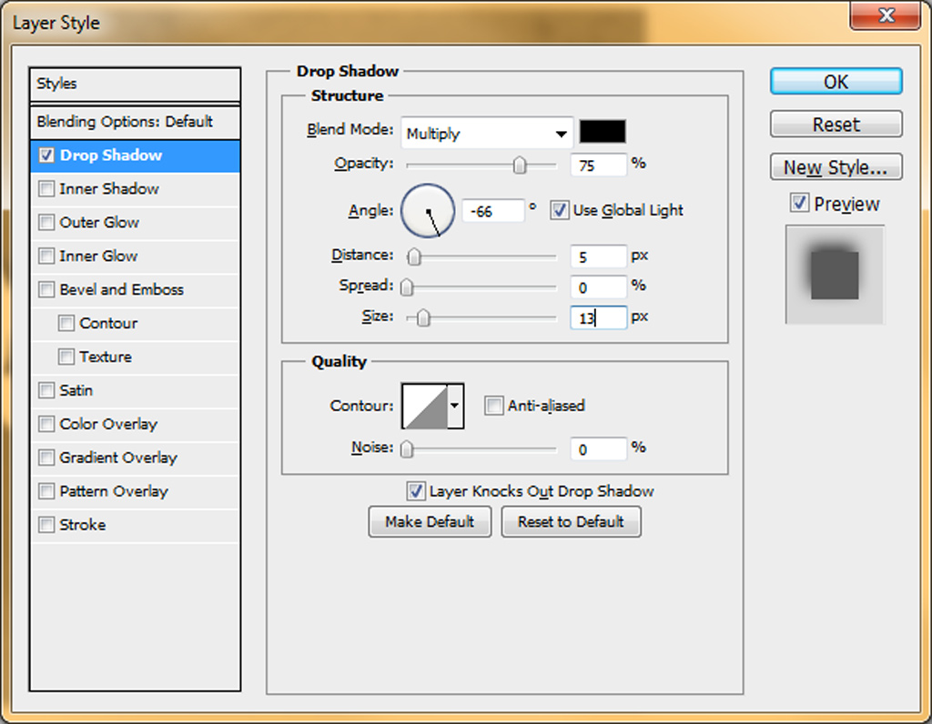
Opening up the "Layer Effects Properties" we will begin to add the necessary effects to modify the text.
Let's begin by selecting the "Drop Shadow" effect.
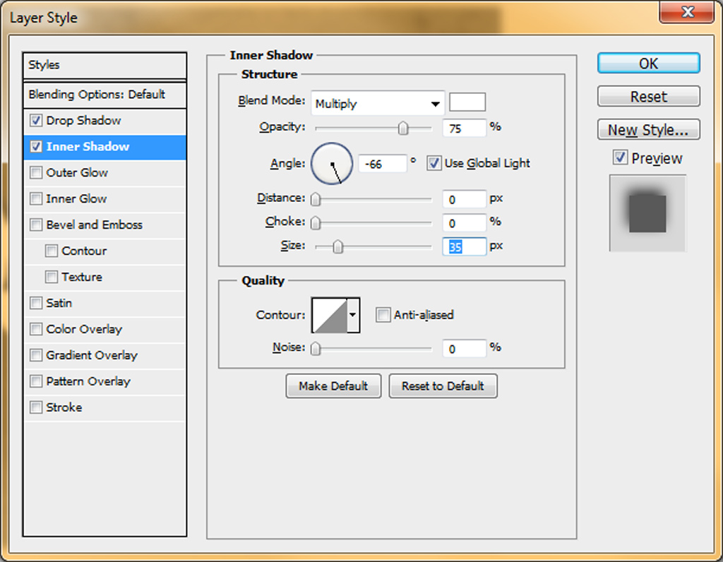
Now, select "Inner Shadow" and change the settings accordingly.
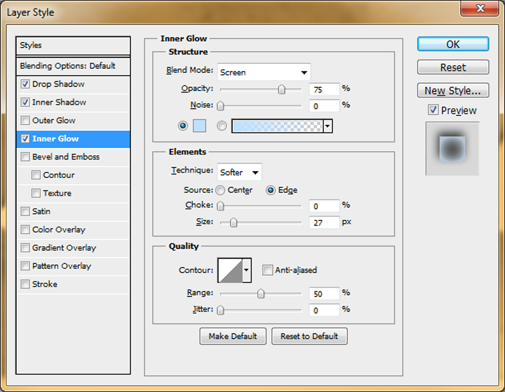
Select the "Inner Glow" effect and make the following changes.
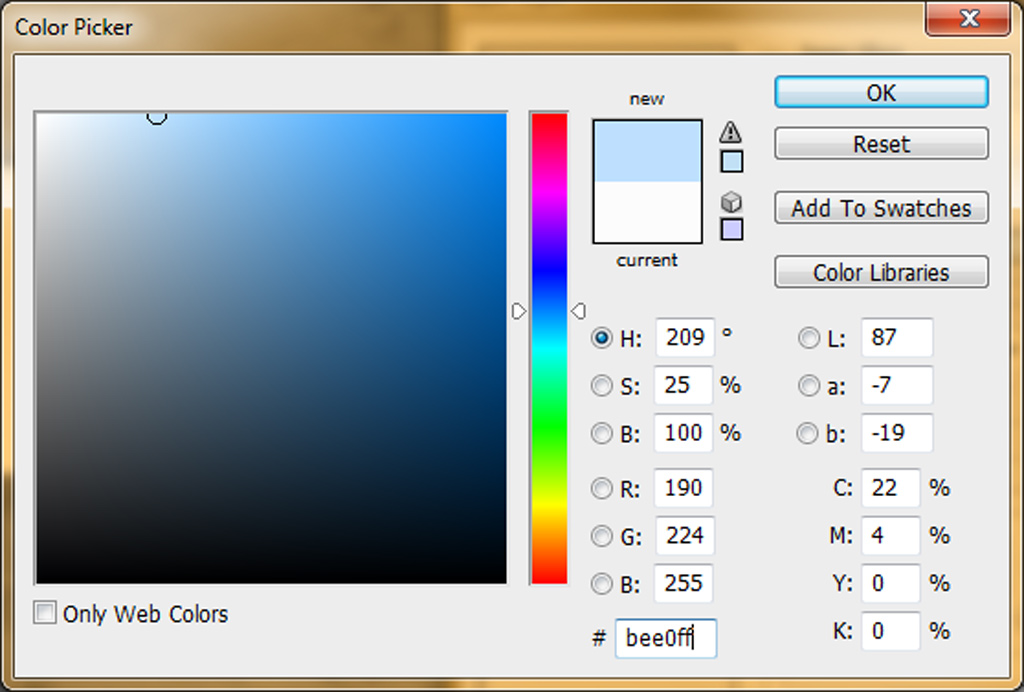
In the "Structure" section, in the image above, I used the following color for the gradient
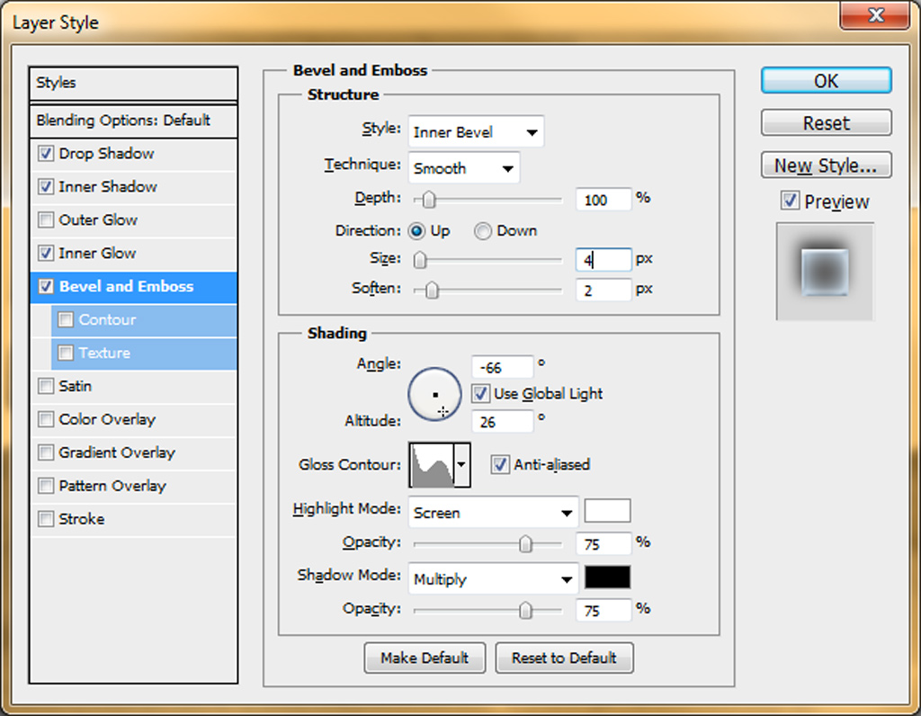
Now lets add the "Bevel and Emboss" effects.
We are now going to add a "Satin" effect.
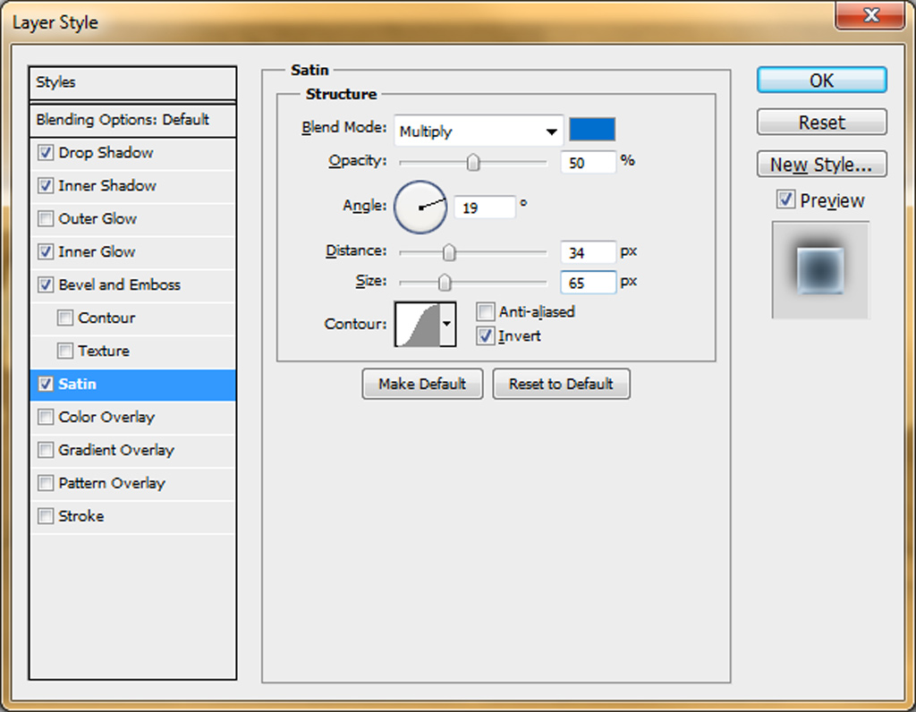
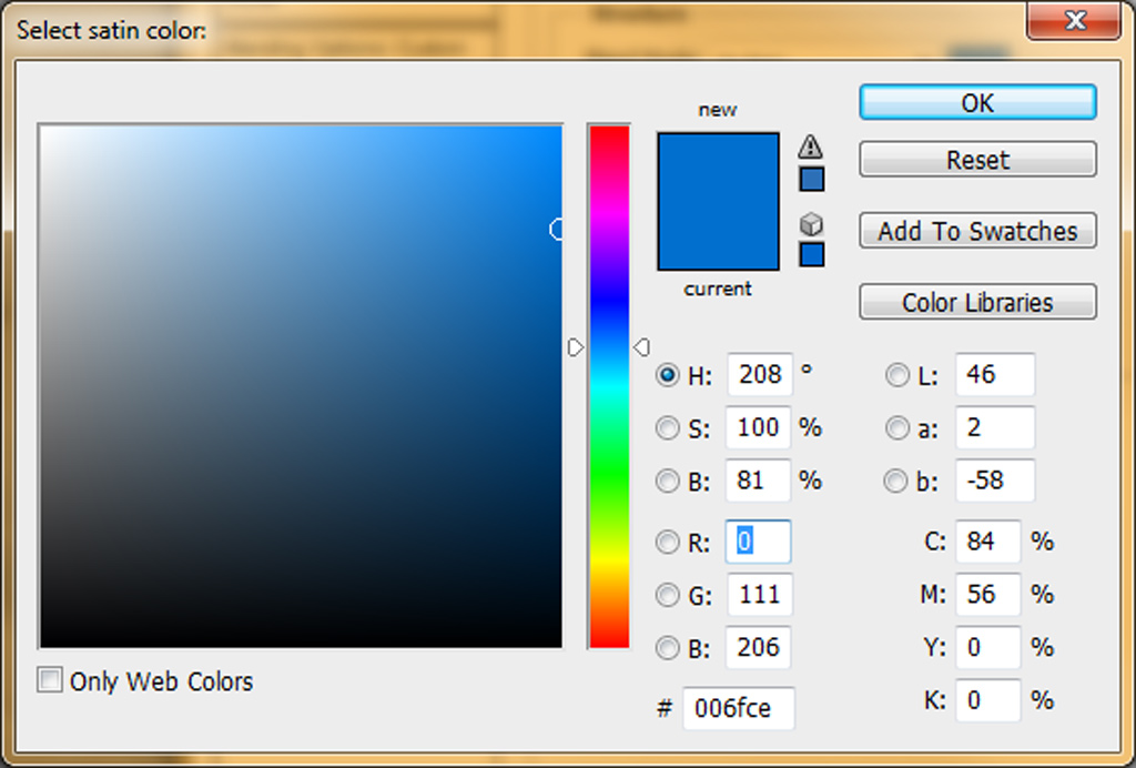
For the Satin "Blend Mode:", I used the following color.
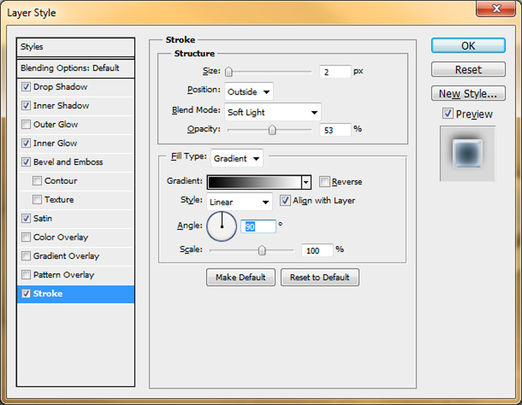
For the final text effect, select "Stroke" and apply these settings.
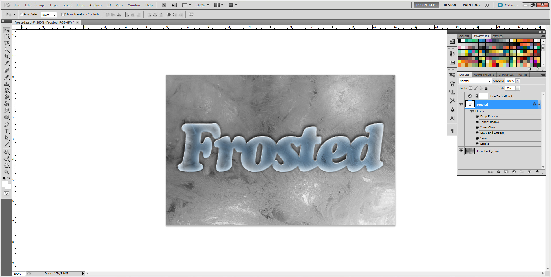
Now that all of the effects have been applied, you should have something that looks like the image below.
Kind of boring, you say? I would have to agree. We can fix that with one more layer. A Hue/Saturation layer to be exact.
Here's how. 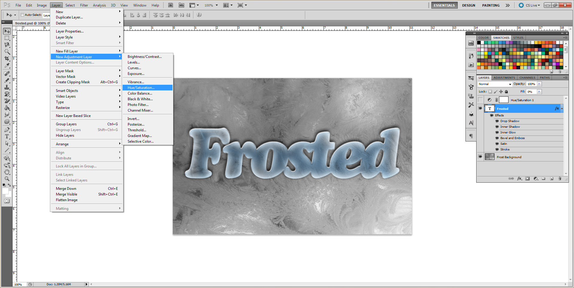 On the top menu, click
 Layer/New Adjustment Layer then click Hue/ Saturation.
Make sure this new layer sits above the text layer in the layer panel. Then change the settings accordingly.
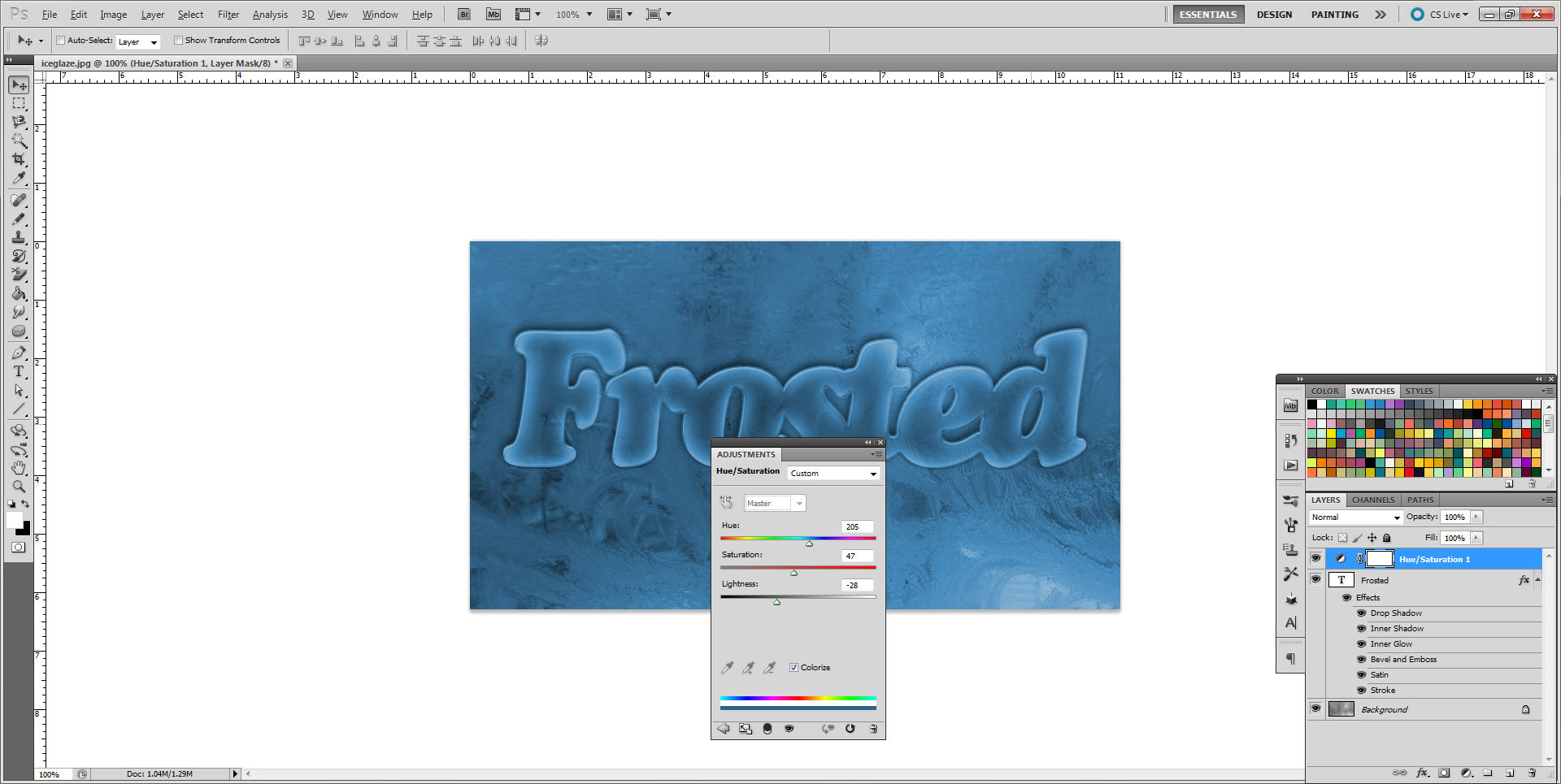
That's it. You should now have an image that looks just like the finished product shown above at the beginning of this tutorial.